Earlier this week, I checked my day’s blog hits and my eyes practically bulged out of my head.
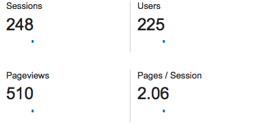 My blog does not usually attract 225 users in a day. I don’t usually get 510 page views in a 24-hour period. In fact, last year in the entire month of February, I got 197 page views. Which means that one day’s hits alone this month were more than twice as many as I got in all of February last year.
Long story short: SaraLaughed is growing.
This is the dream, of course. I love to write, and I am so honored to have people reading what I have to say. At the same time, my blog sometimes feels sloppy. It shows my personality: a little messy, a little loud, and altogether imperfect. But don’t I want something sleeker, more subtle?
I ask myself that question because I’ve recently been learning about blog branding. Some people, when they start a blog, come up with a “brand”: a color scheme, 2-3 fonts, and a clear plan for their content and image. The results are often truly beautiful, and as such, it’s something I’ve been eying for my own blog.
At the same time, I worry that creating a “brand” will mean losing whatever it is that makes my blog unique. You may have noticed some changes around here: I got rid of my wallpaper background and added a sidebar; I’m part of a few blogging networks now; I write more often; I have a Facebook ‘like’ page, for goodness’ sake! And if you’ve been reading this blog for a long time, you might be worried that this is becoming something new. Less personal. Less authentic. Less ‘me.’
I promise that that’s not the case.
I’m working on making SaraLaughed more accessible and recognizable for readers. This means consistent fonts, colors, and elements; but the content will stay the same. I may write more advice pieces, and I may blog more often, but I will continue doing my best to write with authenticity and vulnerability about my life and experiences. You have my word!
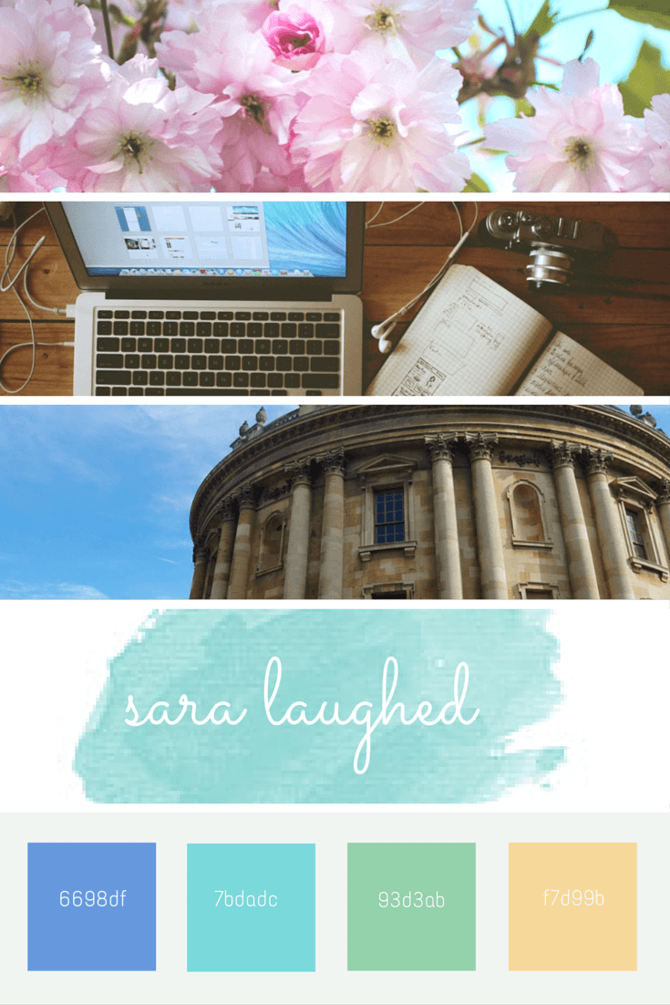
With that said, I am so excited to share the elements of my new design with you! Here is the inspiration image I drafted.
I wanted to keep SaraLaughed colorful and fun, but choose colors that complemented each other well. Since SaraLaughed is quite photo-heavy (which I love!) I thought light, soft colors were the way to go. I also created a new logo, which you’ve likely seen at the top of this page:
I love the aesthetic of watercolors, but soft shades of ballerina pink just aren’t for me. I liked this bright turquoise instead, because it manages to be both both clean and fresh, and fun and bright.
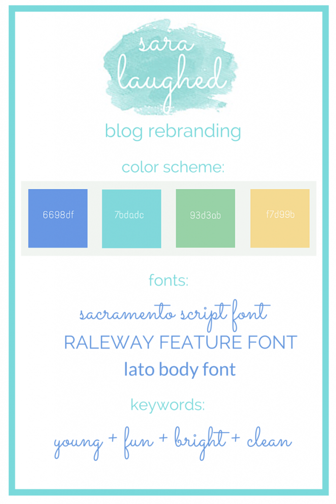
Here, then, is the full “rebrand” scheme I drafted:
The changes have been, and will continue to be, happening gradually, rather than all at once. If you have any thoughts or feedback, please leave them in the comments below!
Wishing you all well on this beautiful Sunday,
Like this content? Never miss a post by liking Sara Laughed on Facebook or following along on Bloglovin’.


Love your new color scheme and fonts!! Congrats for growing your blog! Keep it up!!
xo,
Tatum
thepaceblog.wordpress.com
Thank you so much, Tatum! You have a beautiful blog – good luck with your own blogging and audience!
Love the new colors! 🙂 Good luck with growing your blog! 😀
Thanks so much, Natalie! I’m happy you like the colors as much as I do! (:
I absolutely love the rebrand! I know when I tried to do this, I was completely overwhelmed.
I love your name logo because it feels like a watercolor, it looks great!
Thank you Adriana! I know I felt overwhelmed at first, but it was actually super easy! I may write a blog post about it at some point! Good luck with blogging!
Congratulations on your growing audience, your rebranding looks great and I think you’re going about it really well! I LOVE your color scheme and those fonts are too cute!
xx, Mikkaela
Thank you so much, Mikkaela!
Love your new design ideas. I just recently rebranded my blog with teal as well. The fonts you picked are super cute as well! Good luck making all of your changes!
-Haley
http://www.honestlyhaley.com